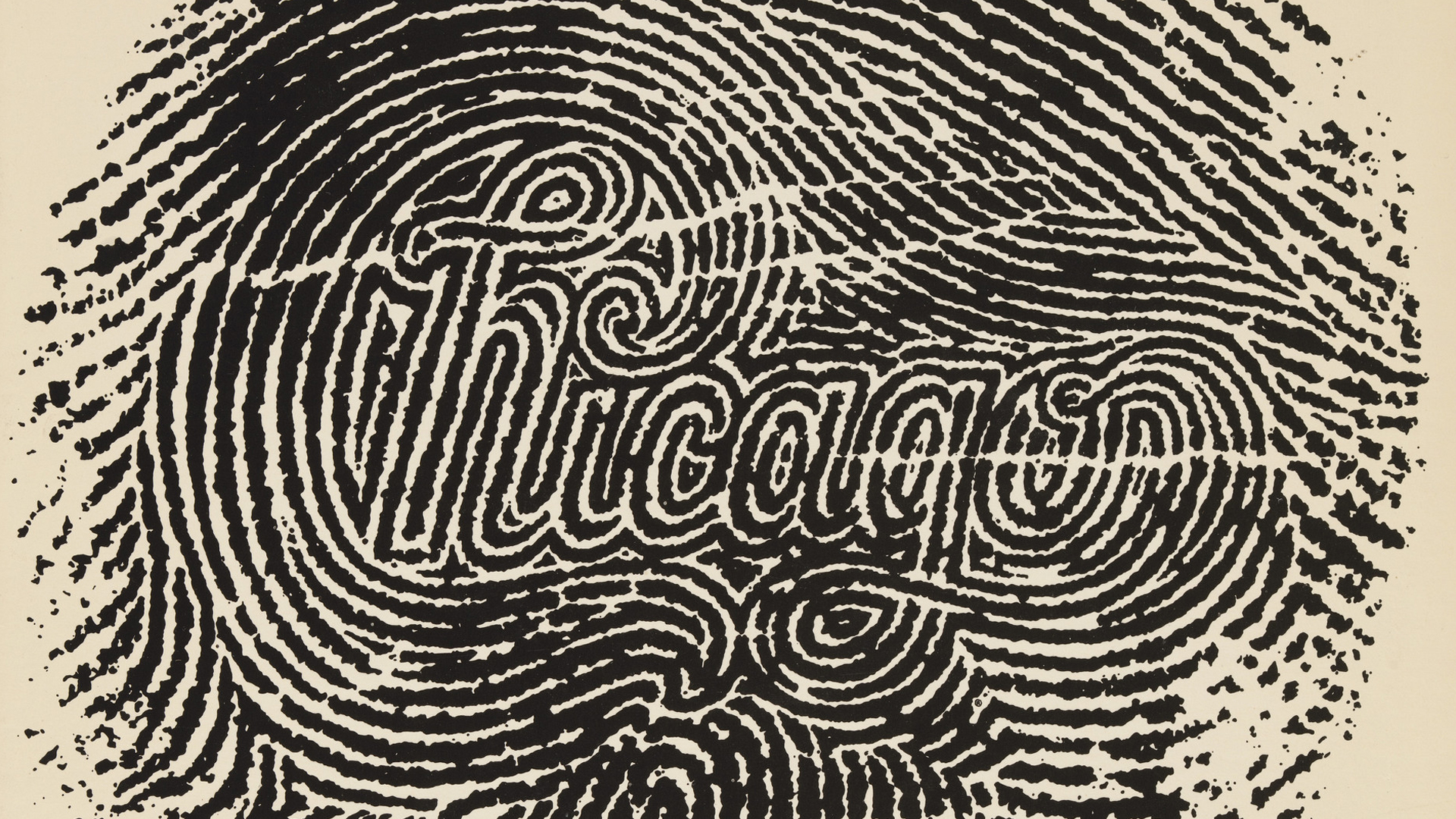
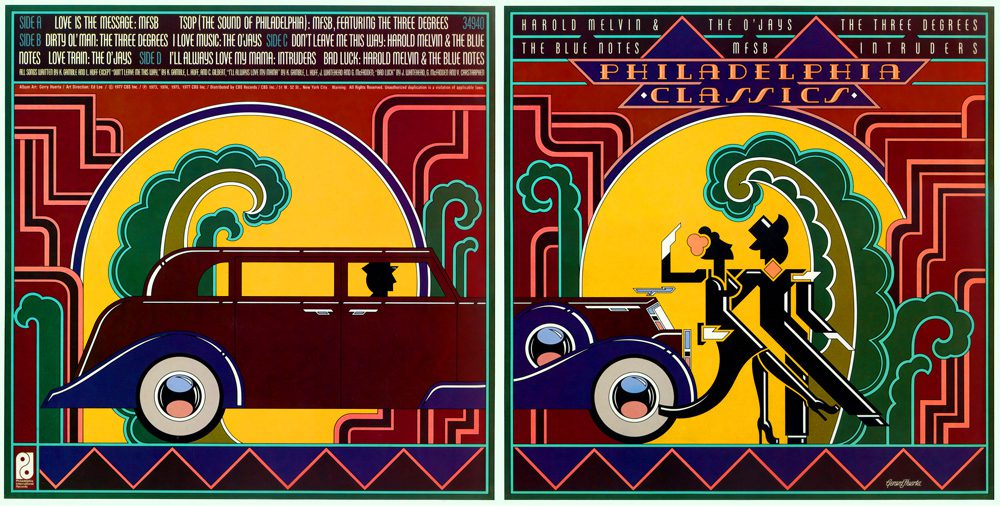
Gerard Huerta is one of those rare graphic designers whose work you might have seen a thousand times — without ever realizing it was his. Born in Southern California in 1952, he trained at the Art Center College of Design in Pasadena, and after graduating in 1974 he moved to New York. There he joined CBS Records as a cover-art and lettering designer, cutting his teeth crafting visuals for musicians ranging from Bob Dylan to Ted Nugent, from Willie Nelson to Blue Öyster Cult.

Drawing Thunder in Letterform — The Enduring Graphic Power of Gerard Huerta
But Huerta didn’t stay inside the record-label box for long. After striking out on his own, he quietly began redefining what branding and typography could mean in popular culture. Suddenly, the shapes on album covers or magazine mastheads weren’t just placeholders — they were attitude, identity, mood.
His most culturally seismic contribution? The iconic logo for AC/DC. In 1977, for the album Let There Be Rock, Huerta refined a lettering style he had experimented with earlier — inspired by the gothic-heavy letterforms of the Gutenberg Bible — and gave AC/DC a logo that still thrums with electricity. Straight lines, no curves, a bold lightning bolt slicing through the name: it became the emblem of hard rock itself.


What’s interesting is Huerta’s process: even amid the dawn of digital design, he remained faithful to analog roots. First came pencil and paper sketches, then the strongest ideas would be taken into the computer — often redrawn in vector form — but always grounded in that first intuitive draft. This hybrid of hand-drawing and digital polish defines a lot of his work: unpretentious, effective, and timelessly flexible.
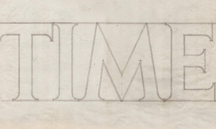
Over the decades, his influence spread far beyond rock-and-roll. He crafted logos, mastheads, identities for giants like HBO, Time Magazine, PC Magazine, and many others. He applied his lettering skills to corporate brands, magazines, product identities, and even watch-dial designs. His ability to navigate so many sectors — music, publishing, fashion, corporate identity — with equal finesse, marks him as one of graphic design’s most versatile modern masters.
What I find endlessly inspiring is how Huerta treats logos not as decoration or marketing gimmicks — but as “instant identifiers,” efficient visual stories embedded in shapes and lines. As he once said: a good logo is simple, flexible, and faithful to what it represents. That philosophy alone speaks volumes about the power of restraint; that less is often more; that clarity can carry emotion, identity, even legacy.
His legacy also whispers a different message to younger designers and illustrators: draw first. Sketch on paper. Let the pencil find the form before the pixel. That instinctual, human layer — the one that flickers between your hand and the page — often carries a rawness that software filters can’t replicate.

Today, whether it’s a heavy metal album, a magazine cover, or a corporate identity, there’s a good chance you’re looking at something influenced (directly or indirectly) by Huerta’s language of letterforms — bold, legible, and alive. And that, in my book, makes him a quiet giant of design.
If you’re curious and want to explore more of his work — from album art to logos to vintage guitar illustrations — check out his website. It’s a glimpse into decades of craftsmanship, reinvention, and typographic brilliance.


