More Than Disposable Covers
What makes the collection especially engaging is how seriously it treats material that was once considered disposable. These paperbacks were designed for mass consumption, sold cheaply, read quickly, and often discarded. But the artwork carried enormous weight. A single image had to create mystery, tension, danger, or desire in seconds.
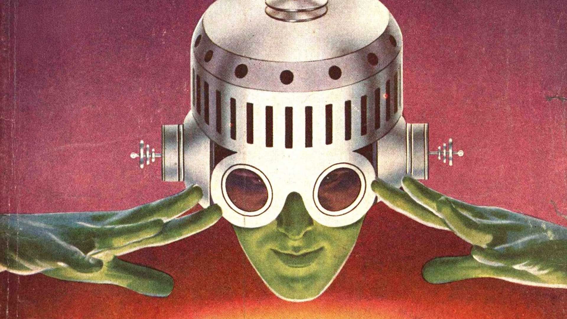
The book traces the transition from pulp magazines to paperbacks as American reading culture shifted after the 1940s. Along the way, familiar figures begin to appear: Frank Frazetta painting explosive fantasy covers, paperback editions of The Lord of the Rings, and lurid crime novels competing for space beside science-fiction classics.
There’s also something fascinating in how these covers reflect the anxieties and fantasies of their time. Women appear constantly—usually glamorous, endangered, or both. Typography grows louder. Colors become sharper. Even relatively restrained novels are repackaged as melodrama through visual suggestion alone.
The Art of Being Seen
Despite its academic value, the book never feels distant or overly technical. It reads like the work of someone genuinely fascinated by these objects and the artists behind them. The captions, essays, and reproductions all carry the same sense of enthusiasm usually reserved for vinyl collectors or film archivists rediscovering forgotten formats.
What emerges isn’t just a history of paperback design. It’s a portrait of a moment when books were tactile, loud, and impossible to ignore—and when cover art could completely reshape the way a story entered your imagination.