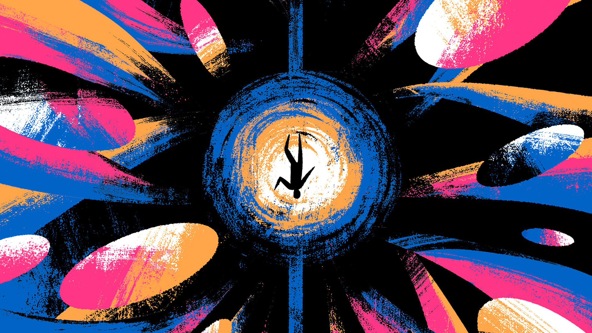

There’s something deeply satisfying about restraint done well. The kind that doesn’t shout, doesn’t decorate for decoration’s sake, but instead locks onto an idea and refuses to let go. That’s where Rafael Nobre operates. A Rio-based illustrator and graphic designer, Nobre has built a formidable body of work shaping the visual identities of books—especially literary classics—through a language of silhouettes, limited palettes, and razor-sharp conceptual clarity.
If you’ve ever stopped mid-scroll because a book cover felt inevitable, like it couldn’t possibly look any other way, chances are you’ve already brushed up against Nobre’s thinking. With more than 80 classic titles illustrated and designed, his approach turns interpretation into synthesis. Text becomes image. Concept becomes form. Decoration steps aside so meaning can take the lead.